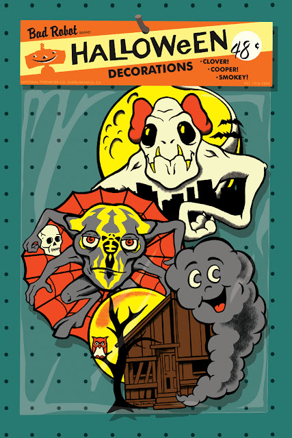
Yet again, rather than writing a real blog post I'm treating the site like a virtual refrigerator door and sticking up my latest piece of artwork. This time the occasion is The Official Bad Robot Art Experience at LA's Gallery 1988 (Bad Robot being J.J. Abrams' production company which is behind stuff like Lost, Alias, Fringe, Cloverfield, Super 8, and the new Star films, both Trek and Wars.) This one fits in better than usual because it's inspired by spooky fun from the past.
During my childhood nothing marked the Halloween season like die-cut, cardstock decorations. At school they constantly tempted my eyes towards the bulletin board, and back home they hung on my living room walls, re-reminding me that it was October during each commercial break. These two were among my favorites...
One of the joys of being a visual artist is wondering what some non-existent thing might look like and then discovering the answer through your work. So as I reflected on the fact that Bad Robot has been slowly building a new generation of movie monsters, I wanted to know what they might look like as classroom-friendly illustrations, hanging in the newly stocked Halloween aisle against a glorious pegboard backdrop.
It made even more sense when I realized that these three monsters echo certain spooky perennials. Clover the Cloverfield monster has bat-like characteristics, Super 8's Cooper borrows from the spider family, and Smokey the smoke monster from Lost has a lot in common with a good ol' ghost. (Aside from Smokey, these names weren't used onscreen, but they are known among film crew and fans alike.)
There's something to be said for creating a one-of-a-kind piece of art without the aid of a computer, specifically things like: "Man, this is hard." and "That's not the way I wanted that to look." and "I've ruined it, where's the undo button?!" That's what inspired my foray into the overcrowded world of digital prints, but boy, oh boy, was it nice to have such control, and yes, that sweet undo button.
I did make it a point to do much of the work away from the computer so I drew the decorations with pencil and ink and scanned them in. I wanted the line quality to have a human touch. When I closely inspected real vintage Halloween directions I was surprised to see how imperfect the line work is.
Anyway, should you wish to purchase one of these prints (it's a signed edition of 40) you can get it here on the gallery's web site.
And if you'd like to see all the art from the show then click on this.
Close inspection of my faux-packaging indicates they originated from The National Typewriter Company. That's the "secret" location of the Bad Robot headquarters seen here...
This is actually just a segue to make it known that my first book is displayed in their trophy room! Think of all the secret plot points it has heard.
J.J. Abrams is a huge fan of the beloved S.S. Adams Prank and Magic company as indicated in the photo below by the tower rack of products seen on the far right (featuring the packaging I designed!)
He even had the artwork from Adams' patented "Mystic Smoke" from fingertips trick enlarged and applied to this editing suite.
More photos of the place can be seen on this site. It's all so cool and yet somehow agonizing. A tiny piece of me is there, and yet I am not.


10 comments:
I still have some of those vintage decorations, so your art made me giddy.
Great, great work.
I long for my own workplace to be as cool as Bad Robot's, but we've got a long way to go. I'm hoping at least our philosophy can resemble theirs. No one's going to understand a "Mystic Smoke" mural...this much I know. The Halloween decorations are awesome!
Love your illustration. It really captures the feeling of those old school hallowe'en decorations.
Slow and steady, a couple more bugs and you'll get a big enough presence in there to slowly work your physical self in ....
You notice in the old die-cut decorations, skeletons were always worried, or scared, or some other emotion than happy or frightening? After saying that, I'm sure people will come up with many exceptions to that, but like you, I loved staring at these decorations in school or houses ... and I also felt sorry for the skeletons. They never seemed to be enjoying halloween!
Justin- Thanks, giddy is good! Make sure to hang up your decorations this year for extra pleasure.
Jody- Thankfully the Bad Robots and Googles of the world show everyone else what is possible. And you can champion the dream! and thanks!
DanS- Thanks so much, that's exactly what I love to hear!
Brian- You make a good point that I hadn't thought of. I have a number of others where the spooks and witches look sort of goofy and/or confused. Meanwhile the Trick or Treaters look quite confident. I wonder if i felt empowered by that.
That piece of art rocks. I love the idea of working in a medium like die-cut cardboard Hallowe'en hang-ups.
My favorite each year was a grinning Jack-O-Lantern with goblin's legs and arms. I loved that thing and still miss it!
Thanks Bobby! I considered cutting them out and having them in an actual bag but this turned out to be more practical. Maybe I'll do that this Halloween.
And I think I know exactly the decoration you're referring to, and it's great.
It must be due to my youth having been spent hanging around in magic shops and fun shops, but EVERYTHING looks better hanging in rows on pegboard!
Excellent and clever work, Kirk! You know, I just realized something. Target needs to hire you to design their Halloween display!
Wow this is cool stuff! This just gave me an idea on my Holloween Party design this year. Thanks.
Post a Comment